A while back, I lent my WikiReader to my sister in law. She seemed to like it, so my wife and I got her one of her own as a christmas-present. Her response was enthusiastic:
Her husband followed-up with:
[Reply] |
I thought this was interesting: If you take a close look at the labels, you'll notice that they're in two different languages--mostly, the ones in the west are in Hebrew and the ones in the east are in Arabic, with some intermixing in some places. As the sidebar says, OpenStreetMap is a (worldwide) community-driven mapping project--to create freely-available map-data that everyone can use, augment, republish, etc.; in the same vein as Wikipedia, [Ubuntu](http://en.wikipedia.org/wiki/Ubuntu_(operating_system)) and the GNU Project, the Creative Commons project, etc. So, basically, what you're seeing in that map is that the map made by the community is labelled using the languages of the people who made (their parts of) the map: the Israelis (and Jews?) made their contributions in Hebrew, and the Arabs made their contributions in Arabic; the mostly-Arabic regions are mostly labelled in Arabic, the mostly-Hebrew regions are mostly labelled in Hebrew, and you can see the dividing lines by looking at the linguistic distribution that the people themselves have plotted (and, if you zoom in enough, you can see it right down to the level of street- and building-names). But there is actually something encouraging about this: regardless of the divisions, everyone is working together on the same project. There's at least some semblance of peace and greater `brotherhood of man' in that. Actually, `a shared project to create freely-sharable maps of the world' does sort-of fit with the next lyrics in that song, too:
Well..., it's a start. My Hebrew teacher remarked:
You can actually get a glimpse at the collaborative process by looking at this: That's a view of the same area in OpenStreetBugs, which is one of the tools used by people working on OpenStreetMap.It's the same map, but with markers that indicate known errors, gaps, routes that are on someone's `cartography to-do list', etc. If you hover your pointer over the markers, textual descriptions of why the markers are there will pop up. If you click on a marker, then you can add a comment to that `bug' (like, "I know that street--I'll check the signs and fix it tomorrow!"); and, if you create an account, you can even edit the map to submit your own contributions (e.g.: fixing a problem; adding new routes, junctions, labels; etc.). The online editor-tool is called "Potlatch", and there's some documentation for it in the OpenStreetMap wiki: Interestingly, though most of the labels in this map are in Hebrew or Arabic, there are some that are in English. Some of the `bug reports' on the map are also in English, and some of them are in different (local?) languges. In the case of bug-reports, I suspect that it's just that English is one of the more prominent international-collaboration languages. But in the case of labels on the map, I think that it just means that someone was interested in having an English label--it may have been someone who either lives there and speaks English, or an English-speaking foreigner who submitted a route that they traced while they were visiting, or even someone abroad who just thought that there was value in having an English label there--and who was able to get enough community buy-in to make the label stick; "Gaza Strip" and "Gaza City", for example, certainly have international interest. I'm not sufficiently literate in either of the predominant languages to be able to figure out whether any of the places with English labels also bear Hebrew labels, or are they all exclusively one-or-the-other, but I wonder about that: I see some labels that appear to be very close-together, but it's not clear to me whether they're labelling the same thing or not. I'm not really clear about all of the details about how the project works (either socially or technically)--my experience so far is just as user, since all of the areas to which I've actually been seem to already be very well-mapped (including data in the sister project: OpenCycleMap, which documents routes/paths and services relevant to pedestrians and bicyclists). I too wonder how things like actively disputed areas work out in OpenStreetMap. It's a very interesting point that OSM may provide a `living' map in the same sense that we've discussed Hebrew being a `living language' in Hebrew class. [Reply] |
I've just finished a very happy-tasting dish of tofu, mushrooms, and bean-sprouts sauté'd in a combination of mustard-oil and `mongolian fire oil', and I'm remembering a conversation that I had with a coworker about her plans to make `spicy fresh spring rolls'.... The recipe had called for a combination of chili-sauce and hot mustard, and she had no hot mustard; her plan was to substitute some Sriracha chili-sauce for the hot mustard, explaining that she `just wanted something with a spicy kick to it'. I had a certain difficulty comprehending that idea, though--because chili-sauce and `hot' mustard don't actually taste anything like each other, and the capsaicin `burn' (at the point of contact) and the AITC `burn' (in the sinuses) are just completely different sensations. There's no way that one can be used to create an experience equivalent to that of the other. It's like substituting a pumpernickel bagel for a chocolate doughnut--as fond as I am of both pumpernickel bagels and chocolate doughnuts..., I would still think, if I were biting into the former when expecting the latter, that I was biting into the worst-tasting chocolate doughnut I'd ever had. And there's the crux of my misunderstanding: what wasn't apparent to me was that she didn't actually want to create an equivalent experience--she actually didn't like the `mustard burn', and would have preferred a modified version of the recipe that lacked that sensation and gave her more of another sensation that she did like. But it got me thinking: if I needed to pick something that was similar to hot mustard--that did provide a similar experience--what would I pick? And I think that I might pick... mint. A good strong dose of (the right) mint, while it does provide some elements very different from mustard, also provides a sort of `surprised' nasal sensation that does bear a certain similarity to the `wasabi rush'. Or is it just me? [Reply] |
OK, so one feature of Facebook actually made me chuckle: 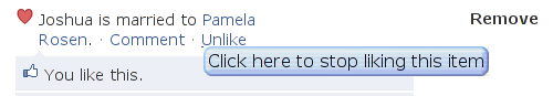
[Reply] |
I recently started hacking on tangoGPS: it's mostly pretty swell (which has made it the most popular GPS/mapping application on the FreeRunner) but there are a couple of things about it that just vex me: One thing is that, because the FreeRunner's amazingly high-resolution LCD is of an amazingly higher resolution than OpenStreetMap expects when they rasterise their map-tiles, labels (and a lot of other details) that would be perfectly legible on a 96-DPI desktop computer monitor are inscrutable on the FreeRunner's >280-DPI screen. So, I fixed that. Another thing is that it can be hard to make much sense out of the stock points-of-interest display. For example, here are a bunch of schools around the area where I grew up: 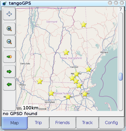
Plotted on this map are campuses for UNH, U-Mass, MIT, Souhegan High School, and a few other random items. It takes considerable conscious effort for me to figure out which is which, even though these are all places that I know (places that I marked on the map!). This display would be great as some sort of statistical scatter plot, but it's mostly useless as a tool for locating specific, individual points of interest: since all of the points look exactly the same, the only attribute that can be used to identify a point is its position, and there's often just not enough `cognitive resolution' to completely disambiguate solely by position--we often just don't think in that level of detail with regard to location, and there's often something akin to quantisation-error when we try. If you happen to be unfamiliar with this region or the schools that I've plotted, then you can immediately appreciate how problematic it can be to have positional cues be the only way to distinguish points: it's worse for unfamiliar territory, where either the region as a whole or the desired point within the region is just not familiar enough for any spatial cues to be useful by themselves. If you're at all familiar with the region depicted in the map, and where the points of interest are supposed to be, then you might expect it to be pretty easy to pick things out, but it turns out that it's actually quite hard to find or identify an individual point in a scatter plot even for `easy' datasets. On the above map, for example, there are very few points of interest, several of them have well-known locations, and no two points are colocated. In other words, this is an `easy' example, and things only get harder from here. The version that has markers for all of the places that are actually of interest to me (or anyone else, I imagine) is much worse. Throw in enough identical-looking `clutter' and anyone would find it virtually impossible to determine which of several closely-spaced points is the desired one. Unfamiliarity just changes the metric for `close', increasing the distance at which two things can remain indistinguishable. This whole situation actually sounds like exactly the same sort of problem-space that motivated the developent of VisualIDs in the first place. The problem was originally laid-out in terms of `scenery for data worlds', with datascapes as an analogue to actual landscapes; but what if the datascape in question turns out to relate somewhat more directly to an actual landscape--what if the `virtual landscape' over which the scenery-points or `landmarks' are strewn is actually a direct representation of an actual, physical landscape? There's something about that that's just perfect. So, I did it. And it was an impressively quick (and impressively clean)
modification--all I had to do was to generalise tangoGPS' POI-icon code
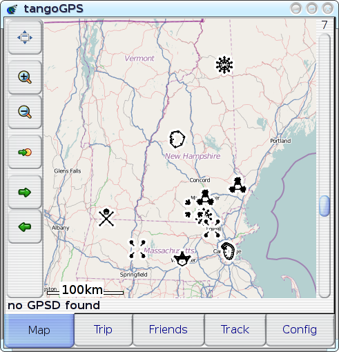
a little bit (adding And, after only some minor tweaks, I can say that it's a resounding success: in my own real-world experience over the past month or so since I actually implemented this and started using it, it's turned out to be a real boon, making tangoGPS' POI display significantly more useful--I've been able to use the POI display to quickly and easily identify travel-destinations before or while navigating to them, and it's also been quite helpful in showing other people where things are. I've even been able to add POIs for new and unfamiliar places just by inputting their lat/lon coordinates and then looking out for a new and unfamiliar icon--then, once I've seen it, it's trivial to find it again. The experience is just so much better that I'm completely unwilling to go back to life without VisualIDs. But pictures can be so much more illustrative, so here's a primer--a quick introduction to mapping with VisualIDs: pick one of these icons, take a loot at the icon and the associated place-name, just for about as long as it would take you to say `oh, that's an interesting icon for NAME' (as you might when you see it appear after recording your point of interest into your GPS):
Now, try to to find:
It's even easy to find the `buried treasure' site, isn't it? So, it works! Though, I've yet to explain the `minor tweaks' mentioned above: while most of the glyph-types make perfectly legible cartographic icons, two of them (`line' and `path') are, unsurprisingly, often difficult to distinguish from the street-segments over which they are drawn--so I simply disabled them. Almost all of the other glyph-types are represented in this screenshot (`shape', `radial', `symmetry', `figure'; the only one that's missing, by sheer happenstance, is `spiral'), and they all work reasonably well; though one obvious issue is that the rendering of `symmetry' glyphs (as for Souhegan High School and U-Mass) may have potential to be confusing, so it may make sense to disable them too, if I can't find a way of rendering them such that the sub-glyphs are more clearly connected to each other. An interesting side-effect of using distinctive icons for POIs, actually relating back to the whole `map with scatterplot' concept: not only is it easier to recognise any single given POI, but multiple POIs are recognisable simultaneously, which causes the relationships between POIs to become apparent. For example: when I was, for the first time, able see all of my favorite places plotted on the map simultaneously and recognisably, it became clear that many things just weren't situated physically in the same way that I had organised them mentally--places that I'd always thought of as `close to each other' turned out to be physically further apart, vice versa, etc. In cases like those, the improvement in POI-recognition has been profound: where I would previously have had to spend time picking through numerous mistaken selections just because I'd started looking in the wrong place, I'm now able to immediately, correctly recognise and select the point that I want--even if it's not quite where I expected it to be. [Reply] |