I just sent this to some teacher-friends of mine:
[Reply] | |||
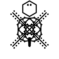
It looks like my opinion on the `meta-primitive art' of VisualIDs is vindicated by actual, direct evidence--JP mentioned, in a recent e-mail:
Look familiar? The Museum of Icelandic Sorcery & Witchcraft website (referenced in the URL at the bottom of the second image) says:
... and includes numerous example-glyphs with explanations. [Reply] | |||
One of the things that really struck me about VisualIDs was something that wasn't even discussed in the original essay--something that even seemed to be conspicuously missing after actually working with VisualIDs for even a brief period: there is ever-so-subtle a mention of the `radial' generator, for example, as having `children that could be interpreted as eyes and a mouth', but there was no mention of just how supportive of that `possibility' the visual details end up being--how cleverly (how artfully) they play on the human tendency to see familiar meanings in familiar forms, even when there's really nothing there. Not only do we see `eyes' and a `mouth' inside a Radial glyph invented by the machine, but the `angle-limited edge-children' (using the terms of the shape-language) even appear as `a hairdo' and, when applied recursively in drawing the inner sub-glyphs, Radial's the edge-glyphs often appear to give the `eyes' eyelashes and to give teeth or a `mustache' to a mouth. When Radial and Line combine to form Figure, they resultant glyphs are strongly suggestive of `animals' and `people'.
These were, I think, the first generators that I implemented, and there was quite a punch to it when it started working and, out of nowhere, the machine drew what I could have sworn was a turtle. It's been really interesting to see what sorts of things are suggested by different Radial/Figure productions: some of the icons in my screenshots, I just can't resist calling things like "ninja", "lion", "turtle", "urchin", "tic-tac-toesoldier", "warrior", "spider".... I do wonder what other people would call them. What I've encountered thus far is that, where I see Shapes as `amoebas', my wife sees them as `thought-bubbles'; a friend of mine remarked that `shaving.htm looks hairy', and my wife referenced one file as "the guy with the spiky hair". These glyphs, which are formed by pseudo-randomly applying the shape-grammar, really and honestly don't have any inbuilt meaning, but it seems that they're so readily assigned meaning that we just can't help it (in the same way that it's nearly impossible to avoid the reading of words, seeing sculptures and canals on Mars, and becoming fraught with cognitive dissonance when we try to cite the colour of the next word: "green"), and that's just... fantastic. Accompanying the original essay were also some stylisation options--merely alluded-to by way of example-imagery rather than being outright specified, the list of ideas included glyphs drawn purely with stark black-on-white lines, glyphs that had been colourised and embossed, and glyphs framed by a couple of different types of auxiliary `aqua blob' elements. I have some ideas for how to implement some of the fancier styles, and even some stylistic ideas of my own (Cairo offers some interesting tools like transparency, gradients, clipping, and various options for stroking a path; coordinate-system transformations also apply when stroking a path--I've actually already had some success using that to render `calligraphically'), but I'm really not all that sure of their value: as neat as the `embossing' idea is, I think that I can appreciate it much more from a graphics-geek perspective than I can from an artistic one. As an artist, I find the whole `vaguely-familiar line-drawing' thing to have excellent perceptual characteristics: it's just so easy for us to relate to it--on an even primal level. It's like... an evolution of cave-paintings. Cave-paintings for the digital age? Indeed. Meta-primitive art. As such, the direction in which I'd like to move, as far as glyph-types goes, is toward additional impressionistic or primitive-art-style images mimicking a broader array of fanciful real-world object-types. My wife, for example, asked me:
In fact, under certain circumstances, certain generators do coalesce to produce semblances of `butterflies'..., but it would be nice to be able to tune the system such that `butterflies' could be a distinct feature rather than a rare and happy co-incidence. The definition of a specific `butterfly character' in the shape-grammar would also open-up some additional possibilities for obvious parameters: not adding too much detail (or, perhaps, too many details), because we want to preserve the `primitive art' aspects, but butterfly-wings do have certain universal tendencies that may not be properly captured solely by the use of a generalised system of polar-coordinate renderings of Fourier-series curves. I can immediately imagine extending the visual language to include faces (Radial); people and animals (Figure); butterflies, dragonflies, and faeries; flowers and trees; snowflakes; etc. These should all be fairly straight-forward, since they can all be broken down into coarse geometric or trigonometric primitives with relative ease, and they seem like they should all be fairly successful with many audiences. Myself, I do sort-of like a lot of the Spirals, and I wonder if part of their appeal is perhaps that they are, basically, sort-of vaguely-similar to flowers..., or maybe the appeal of spirals is just part my own idiopathy. These sorts of things can presumably be sorted-out empirically with sufficient number of testers. Even forgoing the fancier render-styles for straight-up
primitive-style line-drawing generators, I am somewhat interested in
expanding the algorithms to include colour (including fills,
background-vs.-foreground contrast...), and the addition of a
Butterfly generator provide a perfect canvas for that. I do think,
however, that one must be careful there: one should take care to avoid
`colour' being the only distinguishing characteristics of
things. I'm particularly sensitive to this because (is this evident
from the graphics on my site?) I have colour-aberrant vision, myself
( Ultimately, it's almost certainly desirable to come up with ways of making the generated VisualID icons basically `fit in' with the rest of the user's desktop-theme, but that seems like a more bigger and more difficult task right now. Of course, I'd be glad to lend an ear to anyone else who's interested in pursuing that goal. [Reply] |
Here's the trick: if you want to find the Levenshtein edit-sequence that leads from one string to another (or, you think, you just want to know which operation occurs at which position in either string), create the complete cost-table, then start at the terminal position and walk backward to the beginning. It's impossible to walk forward from the beginning, because there's too much ambiguity as to which direction the next `step' should take through the maze, but it's actually easy to walk backward: one merely needs to find the direction that either preserves the cost or decrements it by one, with preference given first to cost-decrement and then to diagonal movement (because diagonal cost-preservation is a `keep' operation, and diagonal cost-decrement is a `substitute' operation; horizontal and vertical movement are either insertion or deletion, depending on which string is the source and which is the destination). [Reply] |
All of the shell-script code is generated by the GNU Autotools, so using Automake, Autoconf, and Libtool apparently cut my development-costs by 4.3 months and 2.17 developers (bringing the price down to a much-more-reasonable $69,849). So, use the Autotools--they could save you more than a quarter-million dollars. Also, if you're unemployed for three months, pretend that you were making less money before you lost your job--I know it makes it hurt less for me to pretend that I only lost $14k.... Actually, that $14k did buy me some cool software. [Reply] |